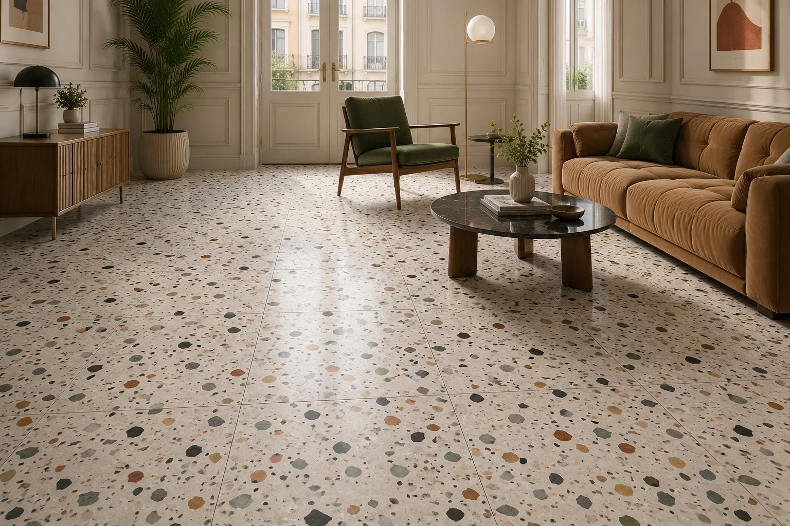
How Lighting Changes the Appearance of Tiles
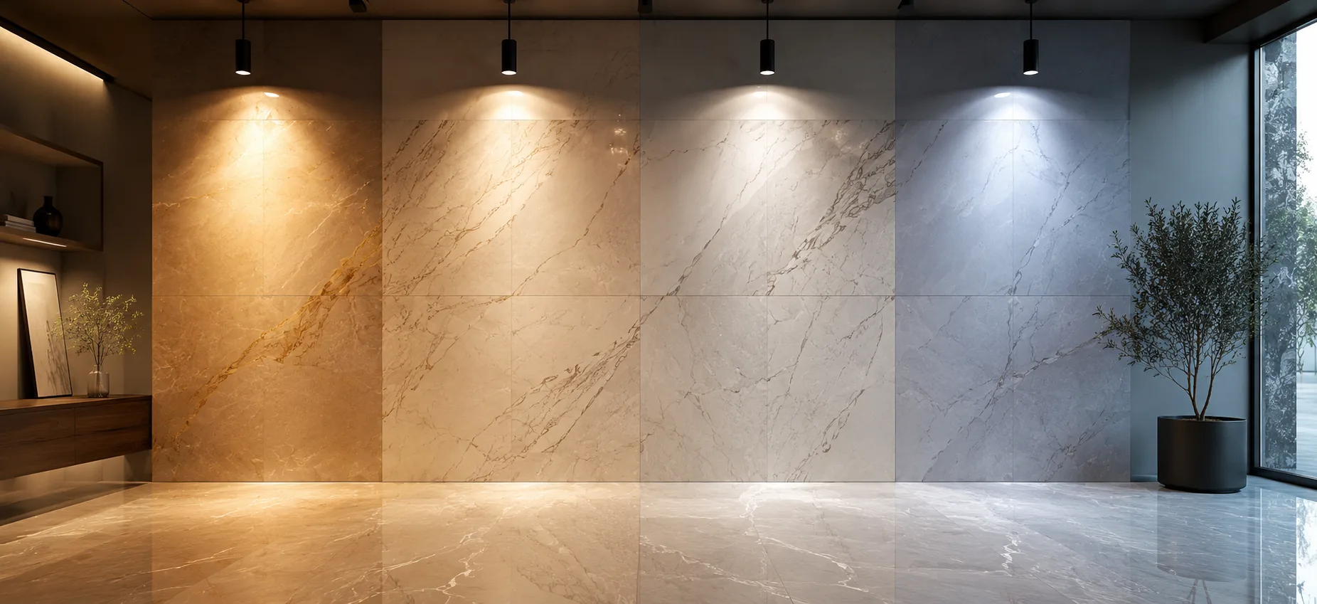
Almost every experienced designer, contractor, or homeowner has a version of the same story: a tile looked perfect under the showroom lights, and looked completely different once it was installed at home. The tile did not change — the light did. Color temperature, direction, intensity, and source type all interact with a tile's surface to change how its color, undertone, and finish are actually perceived, sometimes dramatically.
This guide is written for homeowners choosing tile for a renovation, interior designers and architects specifying finishes across different lit environments, and distributors helping clients avoid a costly mismatch between showroom expectation and installed reality. It explains how lighting changes the appearance of tiles — the physics behind it, how different light sources and room orientations affect specific finishes, and how to test a sample properly before committing to an order.
By the end, you will know why the same tile can look like two different products depending on where it's installed, and how to avoid an unpleasant surprise after installation.
1. Why Lighting Matters as Much as Tile Selection
Tile color and finish are fixed once manufactured, but the light falling on them is not — and perceived color is always the product of both. Two identical tiles, installed in rooms with different light sources, orientations, or fixture placements, can look meaningfully different from one another despite being the exact same product from the exact same batch.
For anyone specifying tile, this means the selection process cannot stop at choosing a color and finish in isolation. The lighting conditions of the intended space are just as much a part of the decision as the tile itself, and skipping that step is one of the most common sources of post-installation dissatisfaction in the industry.
2. The Science of Light and Surface Perception
Color perception depends on the interaction between a light source's spectral composition, the surface properties of the material it hits, and the eye's response to the light reflected back. A tile surface does not emit color; it absorbs some wavelengths of light and reflects others, and what reaches the eye is the reflected portion. Change the spectral makeup of the light source — as happens between daylight, LED, halogen, and fluorescent lighting — and the reflected wavelengths change too, even though the tile itself hasn't.
This is why color temperature, measured in Kelvin (K), is central to understanding tile appearance: lower Kelvin values (around 2700–3000K) produce warmer, yellow-toned light, while higher values (4000K and above) produce cooler, bluer-toned light, and each shifts how a tile's color and undertone read to the eye.
3. Natural Light: How Daylight Direction and Intensity Change Tile Appearance
Daylight itself is not constant — its color temperature and intensity shift throughout the day and depend heavily on a room's orientation:
North-facing rooms (in the Northern Hemisphere) receive consistent, cooler, indirect light throughout the day, which tends to make tile tones read slightly cooler and can mute warm undertones.
South-facing rooms receive stronger, warmer direct light for much of the day, which can intensify warm tones and make even neutral tiles read slightly warmer than expected.
East-facing rooms receive warm morning light that cools through the day, meaning tile appearance can genuinely shift from morning to afternoon.
West-facing rooms receive cooler light in the morning and warm, intense light in the late afternoon and evening, producing a similar but reversed shift.
This is why a tile sample should ideally be viewed in the actual room, at more than one time of day, before a final decision — a single viewing captures only one point in a daily cycle of changing light.
4. Artificial Light: Color Temperature and Its Effect on Tile Tone
Most interior spaces rely on artificial lighting for a significant portion of the day, and the color temperature of that lighting has a direct, predictable effect on tile appearance:
Warm white (2700–3000K): intensifies warm tile tones (terracotta, warm beige, wood-look finishes) and can slightly mute cool tones, making them read closer to neutral.
Neutral white (3500–4000K): renders color relatively true to how it appears in balanced daylight, which is why many showrooms and product photography setups use this range as a baseline.
Cool white / daylight (5000K+): intensifies cool tile tones (greys, blues, cool marble-look whites) and can make warm tones appear slightly washed out or less saturated.
Matching a room's planned lighting color temperature to the tile's intended tonal effect — warm lighting to complement warm tile, cooler lighting to complement cool tile — is one of the simplest ways to ensure the installed result matches the design intent.
5. Light Source Type: LED, Halogen, and Fluorescent Compared
Beyond color temperature, the type of light source affects how accurately and consistently it renders color, measured by a metric called Colour Rendering Index (CRI):
LED lighting is now the dominant residential and commercial choice, energy-efficient and available across a wide range of color temperatures, though CRI quality varies significantly between budget and premium fixtures — a low-CRI LED can render tile color noticeably less accurately than a high-CRI one at the same color temperature.
Halogen lighting produces warm, high-CRI light that renders color richly and accurately, which is part of why it remains popular in some showroom and retail lighting despite being less energy-efficient than LED.
Fluorescent lighting (including older CFL fixtures) often has lower CRI and can introduce a slight green or blue cast that noticeably affects how tile tones, especially warm ones, are perceived.
For rooms where accurate, consistent tile color perception matters — showrooms, galleries, and high-end residential specification — choosing high-CRI (90+) fixtures regardless of source type meaningfully improves color accuracy.
6. How Finish Interacts with Light: Matte, Glossy, and Textured Surfaces
Finish determines how a tile's surface handles the light hitting it, which is just as influential on final appearance as the light source itself:
Glossy and polished finishes reflect light directly and specularly, intensifying brightness and color saturation but also making the surface more sensitive to glare, fixture placement, and reflected surrounding colors.
Matte finishes diffuse light more evenly across the surface, producing a softer, more consistent color appearance that is less sensitive to fixture position but can appear duller under low light levels.
Textured finishes create micro-shadows across the surface that add depth and can make a color appear richer or more variegated, though this effect is highly dependent on the angle and direction of the light source relative to the texture.
A highly reflective glossy tile in a room with harsh, direct overhead lighting can produce glare and washed-out color in exactly the areas where light hits directly, while the same tile in softer, indirect lighting can look rich and luminous — the finish and the lighting plan need to be considered together, not separately.
7. Undertones: Why the Same Tile Looks Different in Different Rooms
Almost every tile, even a tile marketed as "pure white" or "neutral grey," carries a subtle undertone — a faint warm, cool, or grey-based cast that becomes more or less visible depending on the light around it. Undertones are typically invisible in isolation but become obvious in contrast: a warm-undertone white tile can look distinctly cream or yellow next to a cool-undertone white tile under the same light, even though both would be independently described as "white."
This is why lighting-driven appearance shifts are often most noticeable at room transitions — a hallway tile that looked identical to an adjoining room's tile in the showroom can suddenly reveal a mismatched undertone once both are installed under their respective room's lighting conditions.
8. Room Orientation and Time of Day Effects
Beyond the general north/south/east/west patterns covered earlier, practical orientation planning should also account for:
• Window size and placement, which determine how much natural light actually reaches the tiled surface versus how much is blocked by furniture, walls, or partial shading
• Seasonal variation, since daylight angle and intensity shift meaningfully between summer and winter in most climates, changing how a room's tile reads across the year
• Artificial lighting layering, since most rooms rely on a mix of ambient, task, and accent lighting that combine to produce the room's overall effective color temperature, rather than a single fixture type
9. Lighting Tiles for Specific Spaces: Kitchens, Bathrooms, and Living Areas
Kitchens: typically combine bright, high-CRI task lighting over work areas with warmer ambient lighting elsewhere — plan for warm-toned or neutral tile to read well under both, and test backsplash tile specifically under under-cabinet lighting if installed, since that fixture sits closest to the surface.
Bathrooms: often rely heavily on artificial lighting due to limited natural light and privacy considerations — cool or neutral tile under neutral-to-cool white lighting (3500–4000K) tends to produce the cleanest, most consistent result.
Living areas: usually see the widest swing between daytime natural light and evening artificial light, so testing tile samples at both times is particularly important for floors and feature walls in these spaces.
10. Common Mistakes When Selecting Tile Under Showroom Lighting
Trusting showroom lighting as representative. Showrooms are frequently lit with high-CRI, carefully positioned fixtures designed to show product at its best — rarely a match for typical residential or commercial lighting conditions.
Selecting from a digital image or small swatch alone. Screen color rendering and small-sample viewing both distort perceived color relative to a full installed surface under real light.
Not testing at multiple times of day. A single viewing captures only one point in a room's daily lighting cycle, missing how the tile will look for the rest of the day.
Ignoring planned lighting changes. Selecting tile under existing lighting without accounting for a planned fixture upgrade or color temperature change can produce a mismatch once the new lighting is installed.
Assuming all "white" or "grey" tiles are interchangeable. Undertone differences that are invisible in isolation can become obvious once installed next to another surface under the same light.
11. How to Test Tile Samples Correctly Before Buying
15.Request a full-size or large-format physical sample rather than a small swatch or digital image.
16.View the sample in the actual room where it will be installed, not in the showroom or a different room.
17.Check the sample at multiple times of day — morning, midday, and evening — to capture the room's full natural light cycle.
18.View the sample under the room's actual or planned artificial lighting, ideally after dark when natural light is not a factor.
19.Compare the sample against adjoining surfaces (walls, cabinetry, existing flooring) to check for undertone clashes.
20.If ordering a large volume, request the sample from the same batch or a batch-matched reference to avoid a shade shift between the sample and the delivered order.
12. Working with Probity Ceramic LLP: What Sets Us Apart
Probity Ceramic LLP supports designers, distributors, and homeowners in making lighting-informed tile decisions, backed by consistent, batch-matched production that ensures what arrives on site matches what was sampled.
How we help buyers avoid a lighting-driven mismatch:
• Full-size physical samples provided on request, rather than small swatches that understate real-world color and finish behaviour
• Batch and shade documentation on every order, so a large installation reads as one consistent surface under any lighting condition
• A finish range spanning matte, glossy, and textured options across most collections, allowing the same base tone to be matched to a space's specific lighting plan
• Technical data sheets covering surface reflectance characteristics to support designers planning lighting alongside tile specification
What our buyers consistently tell us:
Physical samples, viewed on-site under real lighting, remain the single most reliable way to avoid a post-installation surprise — and consistent batch matching is what ensures a large order looks the way the sample promised, wall to wall or floor to floor.
We work with:
Interior designers and architects coordinating tile specification with lighting plans, distributors advising retail customers on sample testing, and construction companies managing large, consistently lit installations across multi-unit or commercial projects.
Related Articles

The Complete Guide to Import Tiles from India
Best Anti-Slip Outdoor Tiles for Patios, Balconies & Pool Areas