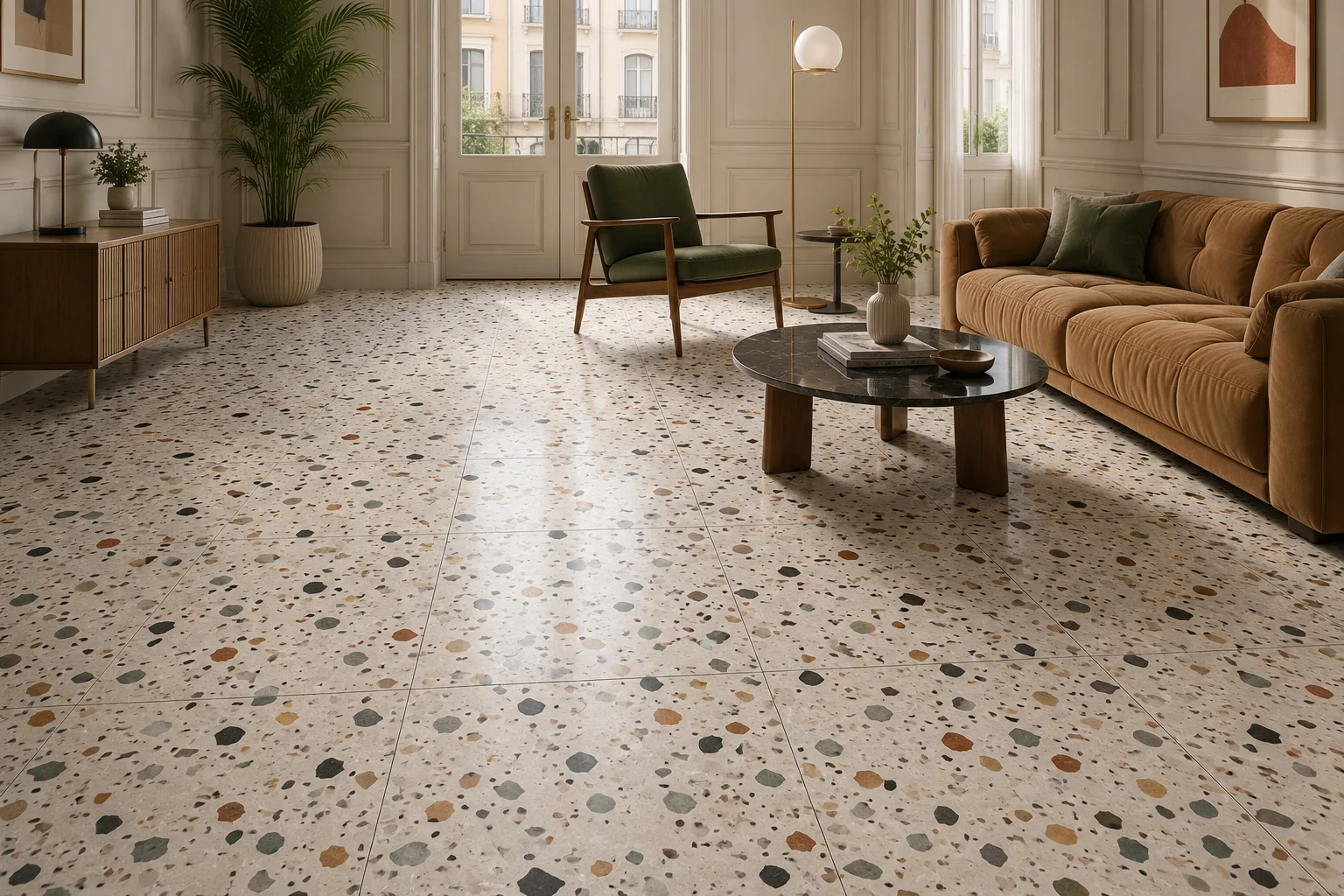
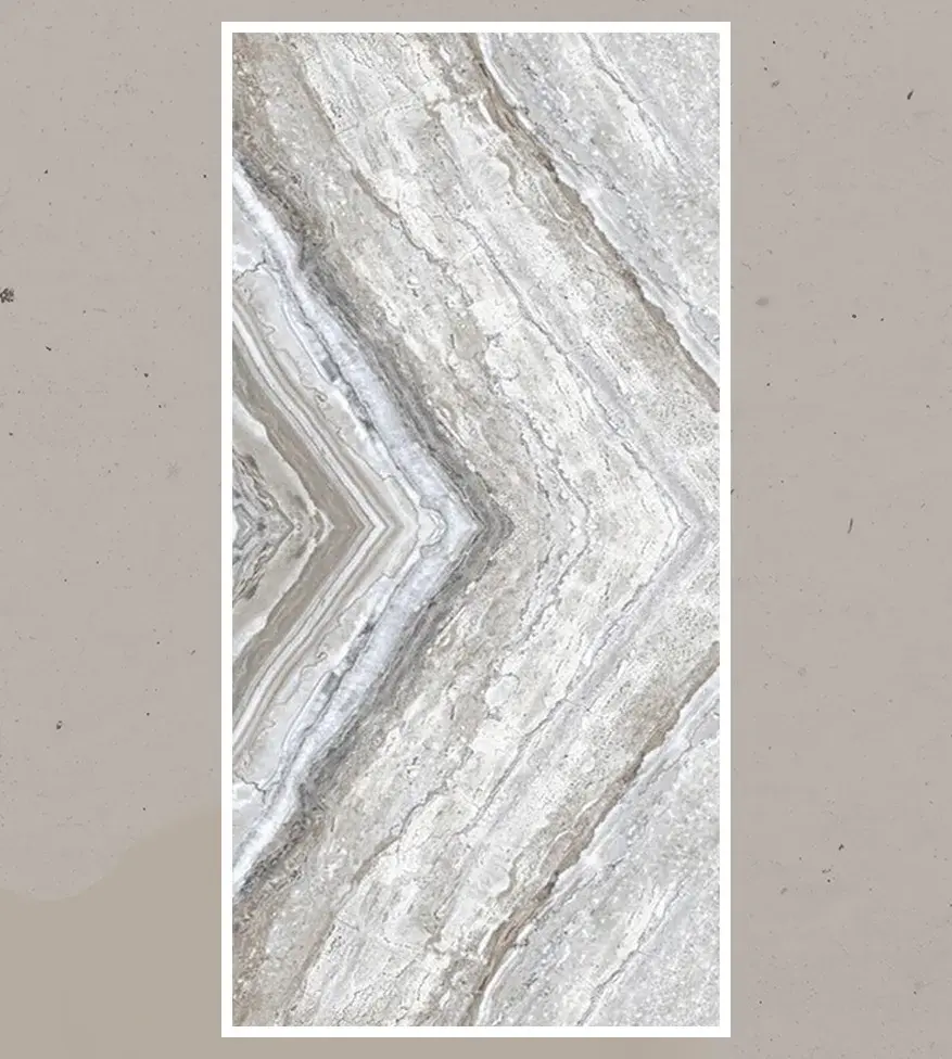
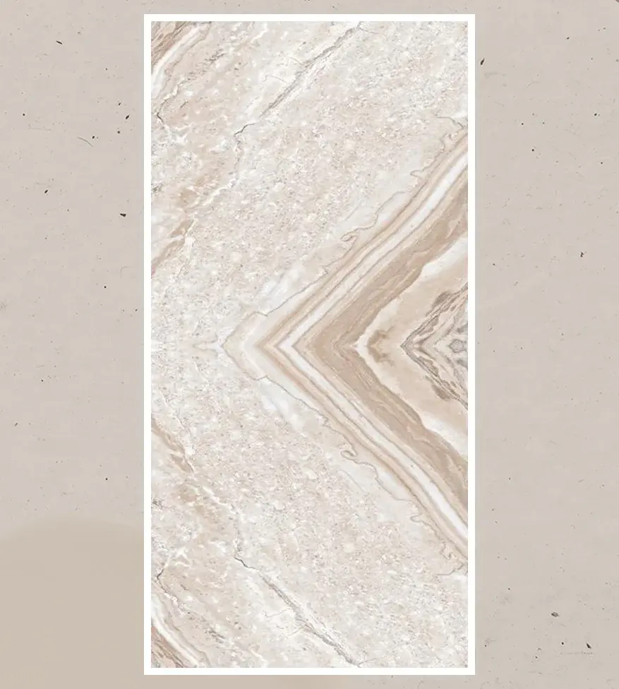
How Tile Color Influences Mood in Interior Design
Long before anyone consciously registers a room's layout or furniture, they register its color. Tile, more than almost any other interior material, sets that first impression — it covers large, continuous surfaces, reflects light in a particular way, and rarely changes once installed. Getting the color right is not a decorative afterthought; it is one of the most influential decisions in how a space actually feels to live in, work in, or move through.
This guide is written for homeowners planning a renovation, interior designers and architects specifying finishes for a project, and distributors advising clients on collection choices. It looks at how tile color influences mood in interior design — the psychology behind specific tones, how finish and light interact with color perception, and how to apply that understanding practically, room by room.
By the end, you will have a working framework for choosing tile color with intention, rather than by trend or instinct alone.
1. Why Color Psychology Matters in Tile Selection
Tile covers more continuous surface area than almost any other interior finish — floors, sometimes full walls, often both in the same room. That scale means its color does more psychological work than a paint accent wall or a piece of furniture ever could, simply by virtue of dominating the visual field. A kitchen floor, a bathroom wall, or a lobby floor sets the emotional tone of a space before anyone consciously evaluates the layout, lighting, or furnishings within it.
Because tile is also one of the least frequently replaced interior finishes — often outlasting paint colors, furniture, and even full renovation cycles — the color decision carries more long-term weight than most other material choices in a project. Understanding the psychology behind it helps ensure that weight is used deliberately.
2. The Science Behind Color and Mood
Color psychology in interior design draws on a well-established body of research showing that hue, saturation, and brightness each independently affect physiological and emotional response — from measurable changes in heart rate and perceived room temperature to shifts in focus and perceived spaciousness. Warmer hues (reds, oranges, warm yellows) tend to read as energising and can make a space feel physically warmer and more intimate. Cooler hues (blues, greens, cool greys) tend to read as calming and can make a space feel more spacious and restful. Brightness and saturation modulate intensity — a muted, desaturated version of a color reads very differently from a bold, saturated version of the same hue.
None of this operates in isolation from culture and personal association — but the broad physiological patterns are consistent enough that they form a reliable starting point for tile color decisions across most residential and commercial design contexts.
3. Warm Tones: Energy, Warmth, and Social Spaces
Warm-toned tiles — terracotta, warm beige, amber, rust, and warm wood-look finishes — tend to create spaces that feel inviting, energetic, and socially engaging. They work particularly well in:
• Kitchens and dining areas, where warmth supports a sense of gathering and appetite stimulation, both well-documented associations with warm color tones.
• Living and family rooms, where warm flooring can offset cooler wall colors or minimalist furniture to keep the space feeling lived-in rather than clinical.
• Entryways and hospitality lobbies, where a warm first impression sets a welcoming tone before a visitor has engaged with anything else in the space.
The risk with warm tones is oversaturation — a fully warm-toned room, floor to ceiling, can start to feel closed-in or visually heavy. Warm tile is generally most effective when balanced against cooler or neutral wall colors and adequate natural light.
4. Cool Tones: Calm, Focus, and Restorative Spaces
Cool-toned tiles — blues, soft greens, cool greys, and blue-undertone whites — tend to create spaces that feel calm, orderly, and restful. They are especially effective in:
• Bathrooms and spa-style spaces, where a cool, clean palette reinforces a sense of restoration and hygiene.
• Bedrooms, where cool tones support the calming, low-stimulation environment associated with better rest.
• Home offices and study spaces, where cooler tones are associated with improved focus and reduced visual fatigue over long periods.
Cool tones can read as cold or sterile if overused without any warmth to offset them — a common fix is pairing cool tile with warm wood accents, textiles, or lighting with a warmer color temperature.
5. Neutral Tones: Versatility and Timeless Balance
Neutral tiles — whites, greys, greiges, and warm or cool-toned taupes — remain the most widely specified tile category precisely because they offer psychological flexibility. A well-chosen neutral can read as calming or grounding without pulling strongly toward either the "energising" or "restful" end of the color spectrum, letting furniture, art, and accent colors do more of the emotional work in a space.
Neutrals also carry practical advantages that reinforce their psychological role: they age well against changing furniture and decor trends, and they photograph and show well in resale contexts, which is part of why they dominate both residential flipping and large-scale commercial specification.
6. Color by Room: Matching Tile Tone to Function
Kitchens: warm neutrals or warm accent tones support appetite and social energy; balance with cooler countertop or cabinet tones to avoid visual heaviness.
Bathrooms: cool tones or clean whites reinforce a restorative, spa-like feel; warmer tones work well in powder rooms designed for a bolder, more social statement.
Bedrooms: muted cool tones or soft neutrals support rest; avoid highly saturated warm tones that can feel overstimulating in a space meant for winding down.
Living rooms: warm neutrals or mid-tone wood-look finishes support a lived-in, social atmosphere while remaining versatile against changing furniture.
Home offices: cool or neutral tones support sustained focus; avoid highly saturated or high-contrast patterns that can become visually fatiguing over a full working day.
Commercial and hospitality lobbies: bold or contrasting tones can be used deliberately to make a strong first impression, provided the intensity is balanced by the scale and lighting of the space.
7. The Role of Finish and Texture in Perceived Mood
Color does not act alone — finish changes how a color is actually perceived. A glossy finish reflects more light and tends to intensify a color's brightness and vibrancy, while a matte finish absorbs more light and softens the same color, often reading as more grounded or muted. Textured surfaces add depth and shadow variation that can make a color feel richer and more tactile, while a smooth, uniform finish reads as cleaner and more minimal.
This means the same base color can produce noticeably different moods depending on finish choice — a matte cool grey feels calm and grounded, while a high-gloss version of the same grey can feel sharper, more formal, and more reflective of surrounding light and color.
8. Light, Shadow, and How They Change Tile Color Perception
Tile color is never seen in isolation from the light around it, and this is one of the most commonly underestimated factors in color selection. Natural daylight shifts color temperature throughout the day, artificial lighting varies significantly in color temperature between warm (2700–3000K) and cool (4000K+) fixtures, and a room's orientation (north-facing versus south-facing, for example) changes how much and what quality of natural light a tile receives.
The same tile sample can look noticeably different in a showroom under commercial lighting than it will in the actual installation space. Always view physical samples in the room and lighting conditions where the tile will actually be installed — ideally at different times of day — before finalising a color decision, particularly for large-format or highly saturated tiles where the effect is most pronounced.
9. Combining Colors: Contrast, Harmony, and Accent Tiles
Most interior spaces benefit from a considered color relationship rather than a single uniform tone throughout. Common, well-tested approaches include:
• Monochromatic harmony: varying tones and finishes within a single color family for a cohesive, calming effect without visual flatness.
• Warm-cool balance: pairing a dominant warm or cool tile with an opposing accent (warm wood tones against cool tile, or vice versa) to prevent a space from feeling one-dimensional.
• Accent or feature tiling: using a bolder color or pattern on a single wall, backsplash, or floor inset to create a deliberate focal point without overwhelming the whole space.
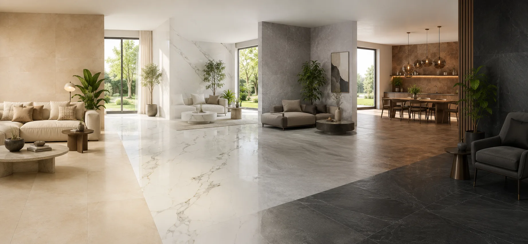
• Transitional zoning: using tone shifts between connected spaces (a warmer kitchen tile transitioning to a cooler adjacent living area) to subtly signal a change in function without a hard visual break.
10. Common Mistakes in Color Selection for Interior Tiling
Choosing color from a small sample or digital image alone. Color perception shifts significantly at full scale and under real lighting conditions — always view a large physical sample in situ.
Ignoring the room's natural light orientation. A cool tone that feels calm in a bright, south-facing room can feel cold and flat in a north-facing room with limited natural light.
Over-committing to a trend-driven bold color. Because tile is a long-lifecycle material, a highly trend-specific color can date a space faster than paint or furnishings, which are easier and cheaper to update.
Underestimating the emotional weight of large surface areas. A color that feels fine in a small sample or accent piece can become overwhelming across an entire floor or wall.
Not considering finish alongside color. Selecting a color without testing it in the intended finish (matte, glossy, textured) can produce a noticeably different result than expected once installed.
11. Emerging Color Trends in Porcelain and Ceramic Tiles
Current design direction in porcelain and ceramic tile has moved toward warm, earthy neutrals — terracotta, warm greige, and soft clay tones — alongside continued strong demand for classic marble-look whites and greys with warm undertones. There is also growing interest in deeper, more saturated accent tones (forest green, deep terracotta, charcoal) used deliberately in smaller applications such as kitchen islands, powder rooms, and feature walls, reflecting a broader design shift toward spaces that feel warmer and more personal rather than purely minimal.
12. Working with Probity Ceramic LLP: What Sets Us Apart
Probity Ceramic LLP manufactures porcelain tiles across an extensive color and finish range, built to give designers and distributors the flexibility to specify tone, warmth, and finish precisely rather than settling for a limited palette.
Our color and finish capability covers:
• Warm and cool marble-look collections including Calacatta, Statuario, Carrara, and Onyx, each available across multiple undertone variations
• Wood Finish, Stone Finish, and Concrete Finish ranges spanning warm, neutral, and cool tonal families
• Matte, glossy, polished, and textured finish options across most collections, allowing the same base tone to be adapted to different mood requirements
• Large-format slabs that minimise grout lines for a more seamless, immersive color effect across floors and walls
• OEM and private label color development for distributors building a differentiated, mood-led collection
What designers and distributors consistently ask us for:
Physical, full-size samples rather than digital renders, consistent shade matching across large orders so a full floor or feature wall reads as one continuous tone, and finish options that let the same base color serve both calming and energising design briefs.
We work with:
Interior designers and architects specifying finishes for residential and hospitality projects, distributors curating mood-led collections for their retail customers, and construction companies sourcing consistent, large-volume color-matched tile for multi-unit developments.
Conclusion
Tile color is one of the most consequential and longest-lasting decisions in any interior design project — it sets the emotional register of a space before anyone consciously registers why. Understanding how warm, cool, and neutral tones function, how finish and light reshape color perception, and how to apply that knowledge room by room turns color selection from a matter of taste alone into a deliberate design tool.
Whether the goal is a warm, social kitchen, a calming spa-like bathroom, or a focused home office, the right tile color — chosen with an understanding of how it will actually be seen, lived in, and lit — does more to shape how a space feels than almost any other single material decision.
Related Articles

The Complete Guide to Import Tiles from India
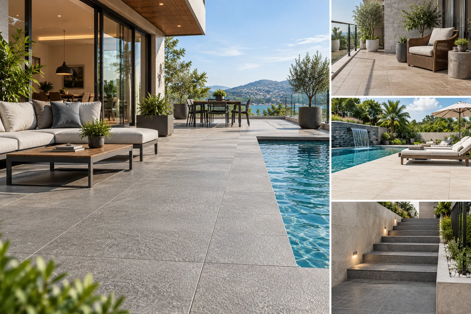
Best Anti-Slip Outdoor Tiles for Patios, Balconies & Pool Areas